St. Patrick’s High School
When completed in the 1970s from the French language school board in Ottawa what is now St. Patrick’s High presented a very different architectural image than a “normal” school. Typically, the role of designing a high school in Ottawa was handled by the Ottawa firm of Hazelgrove, Lithwick and Lambert, resulting in general uniformity between schools constructed within a particular generation. Those schools typically featured brick and ribbon windows, spreading out horizontally, and capturing a generally “institutional modern” school image. An example of this type is school is located right next door: Ridgemont High School.
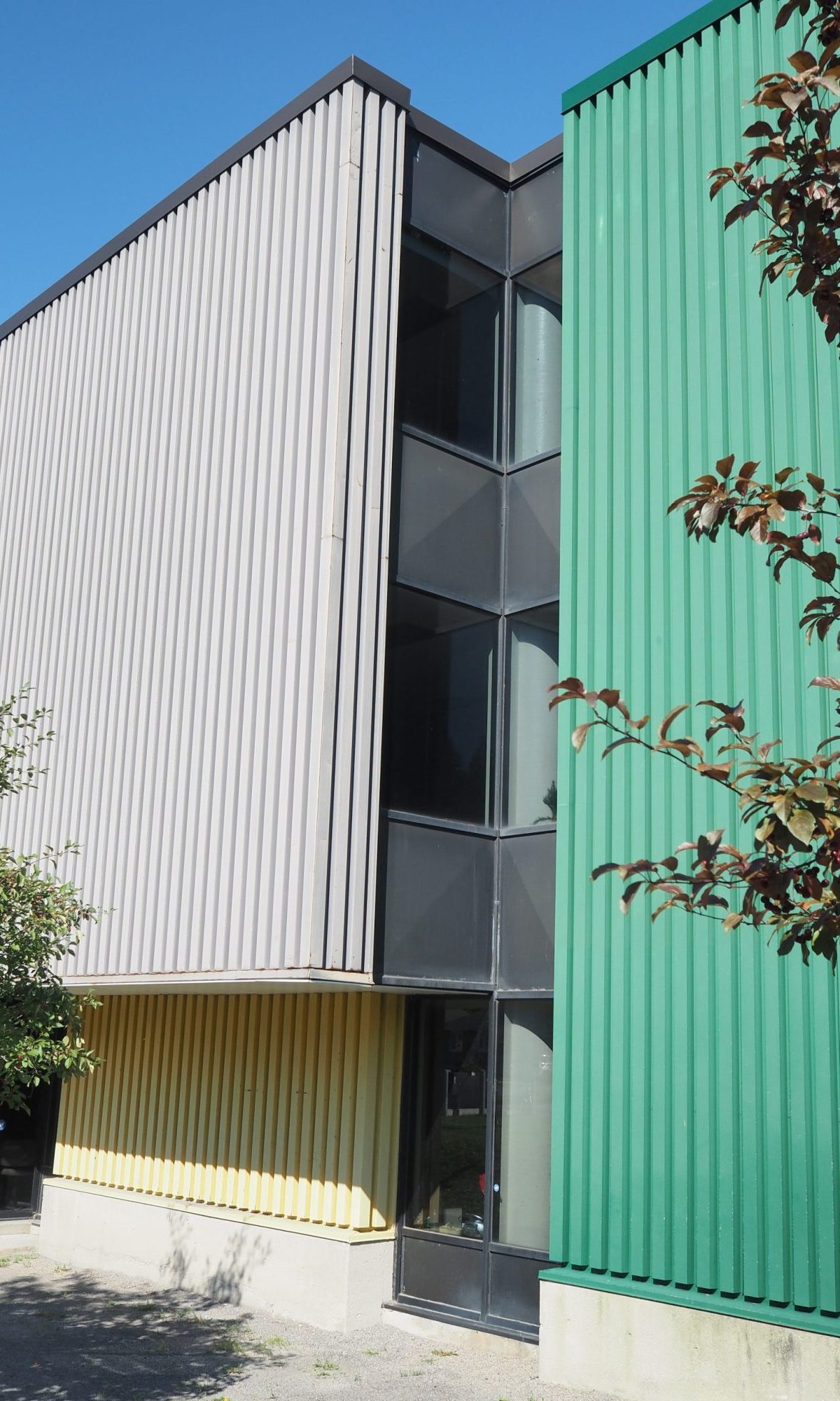
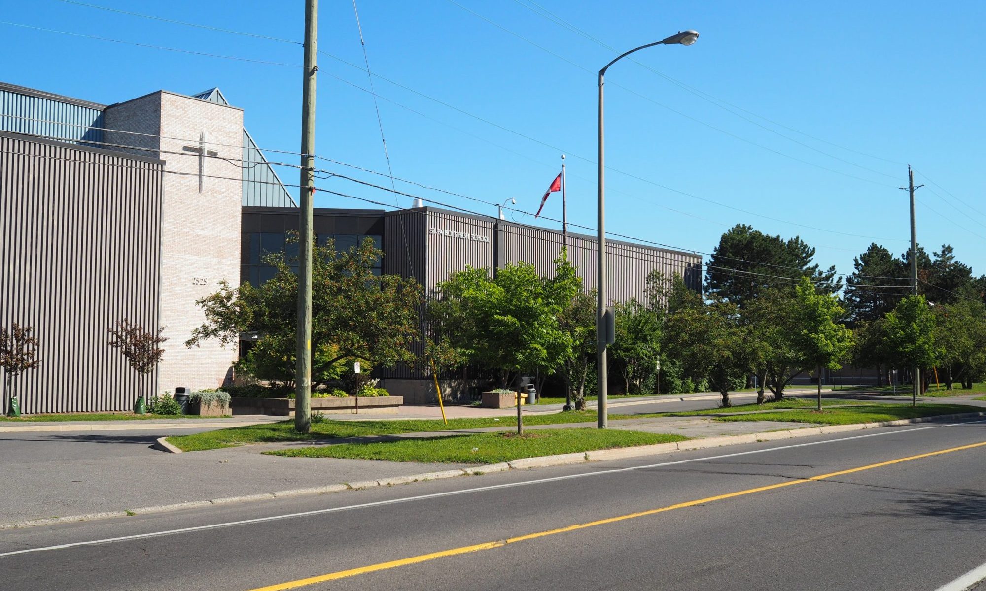
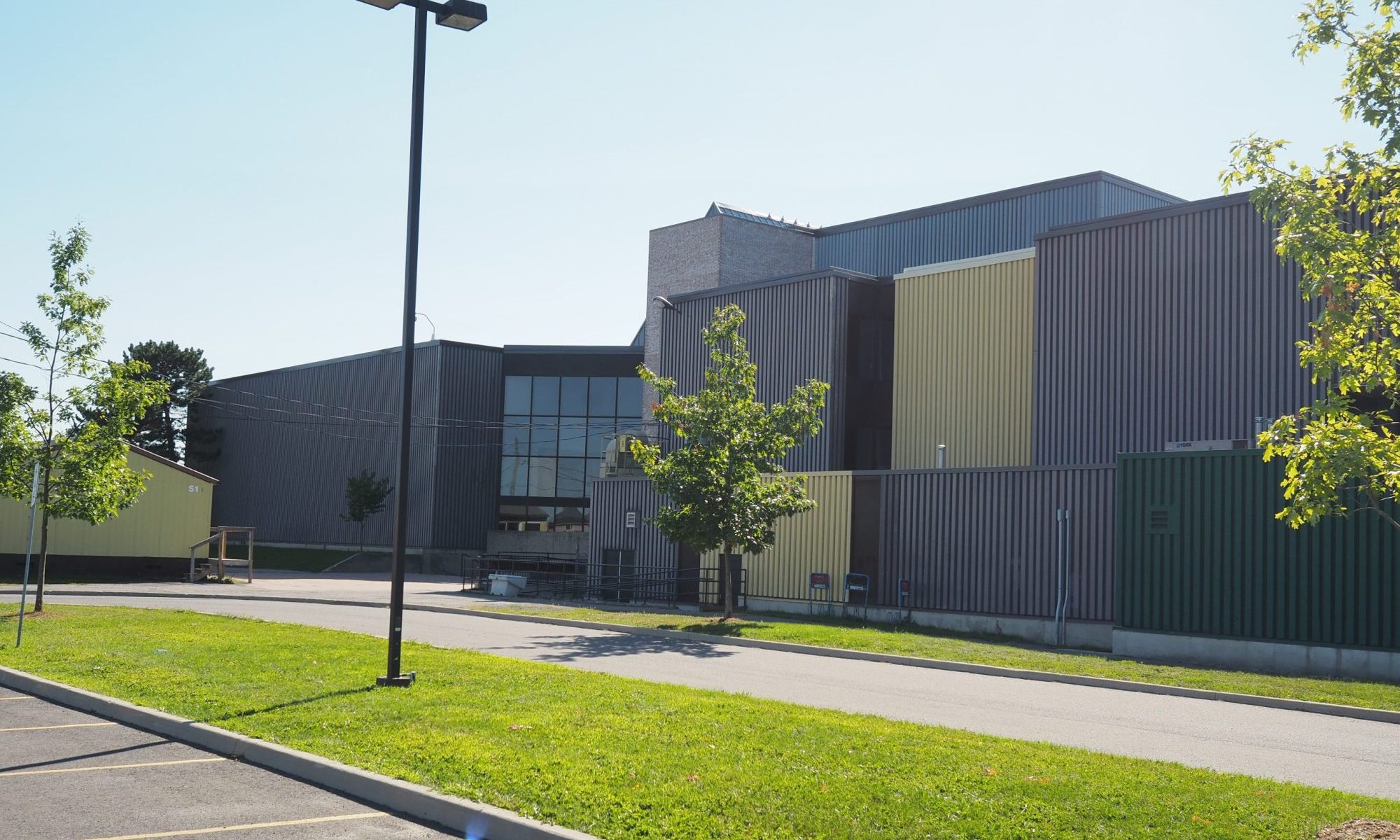
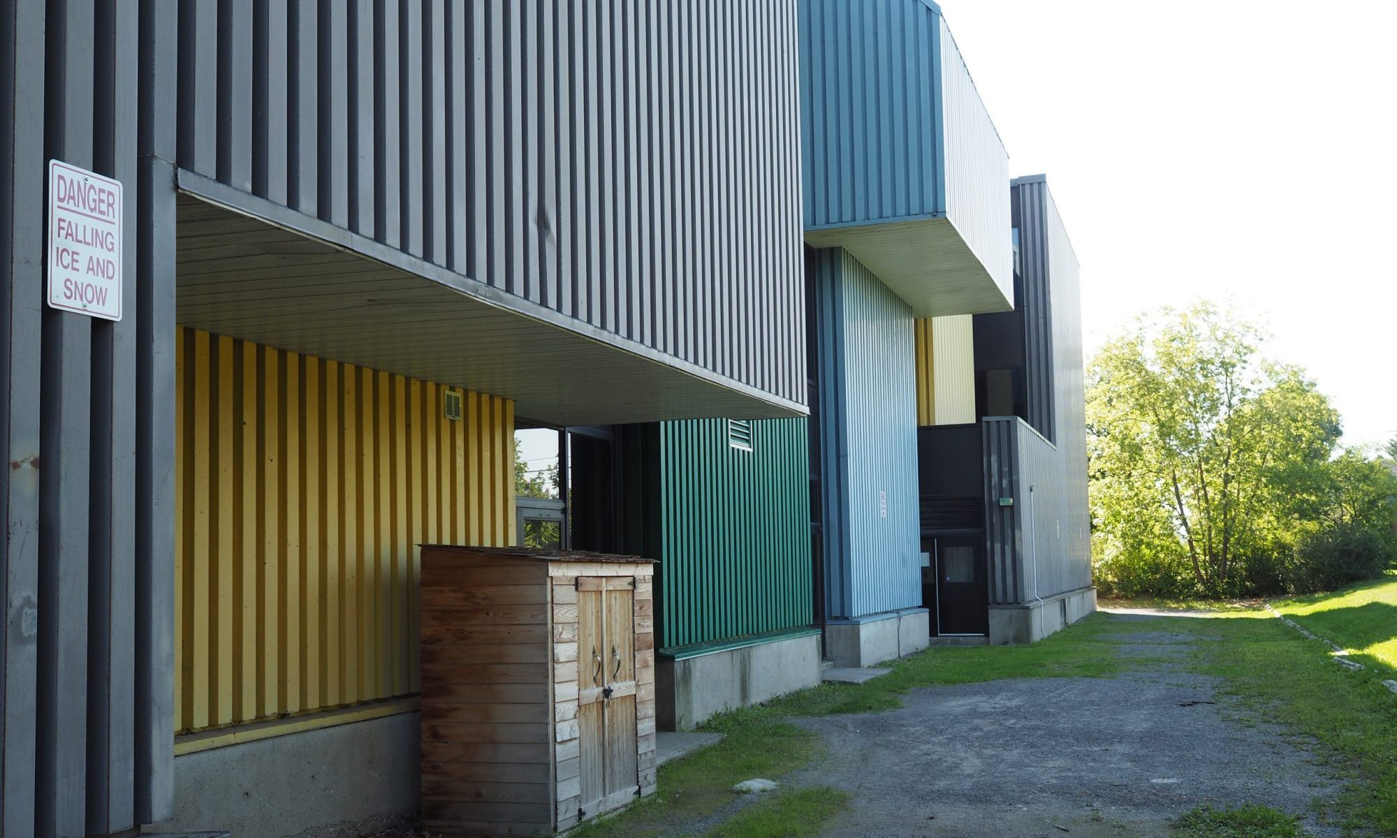
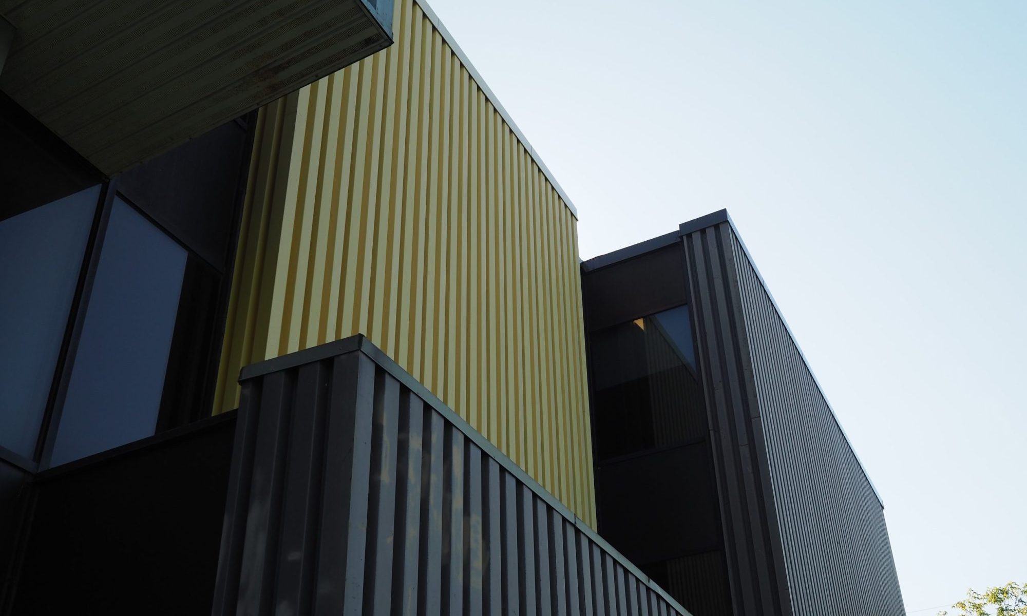
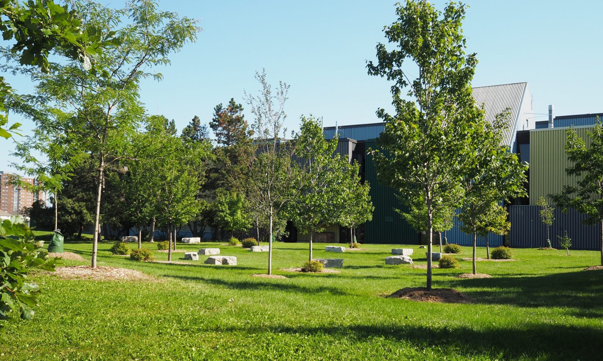
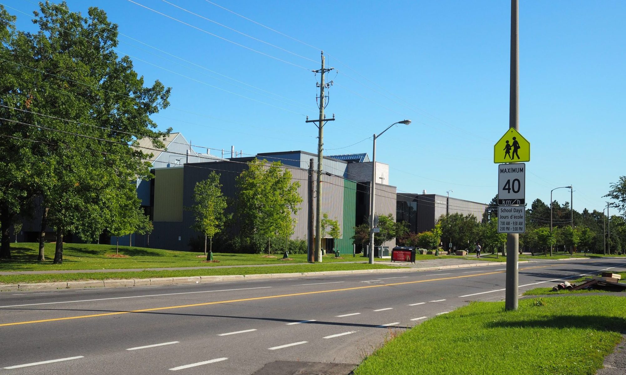
Designed by Schoeler, Heaton, Harvor, Menendez, Ecole Secondaire Charlebois, as it was originally known, represented a significant departure from what had become the Ottawa standard for high school architecture. Rather than subdued brick and horizontality, the high school was finished in brightly coloured prefinished metal contrasting with a quieter prefinished metal to create a more visually adventurous exterior composition that emphasized the mass of the various architectural elements. This was especially true for the primary elevation that graced a large green space facing Heron Road.
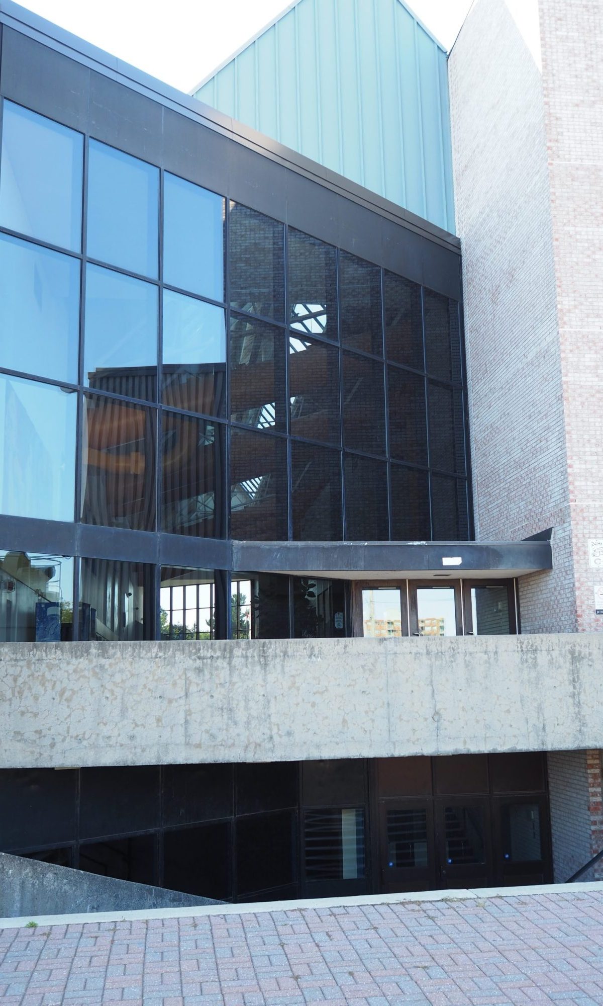
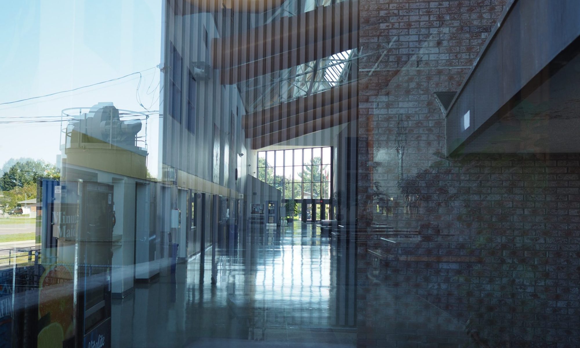
The emphasis on bright colours and mass continued on the inside through the main entrance that occupied a void between the two primary masses. This space was more than just the entrance; it was designed as an activity condenser with a glazed roof, brightly coloured exposed ductwork, seating and carpeting that mediated the space between the north (classrooms) and south (cafeteria, gymnasium and theatre).
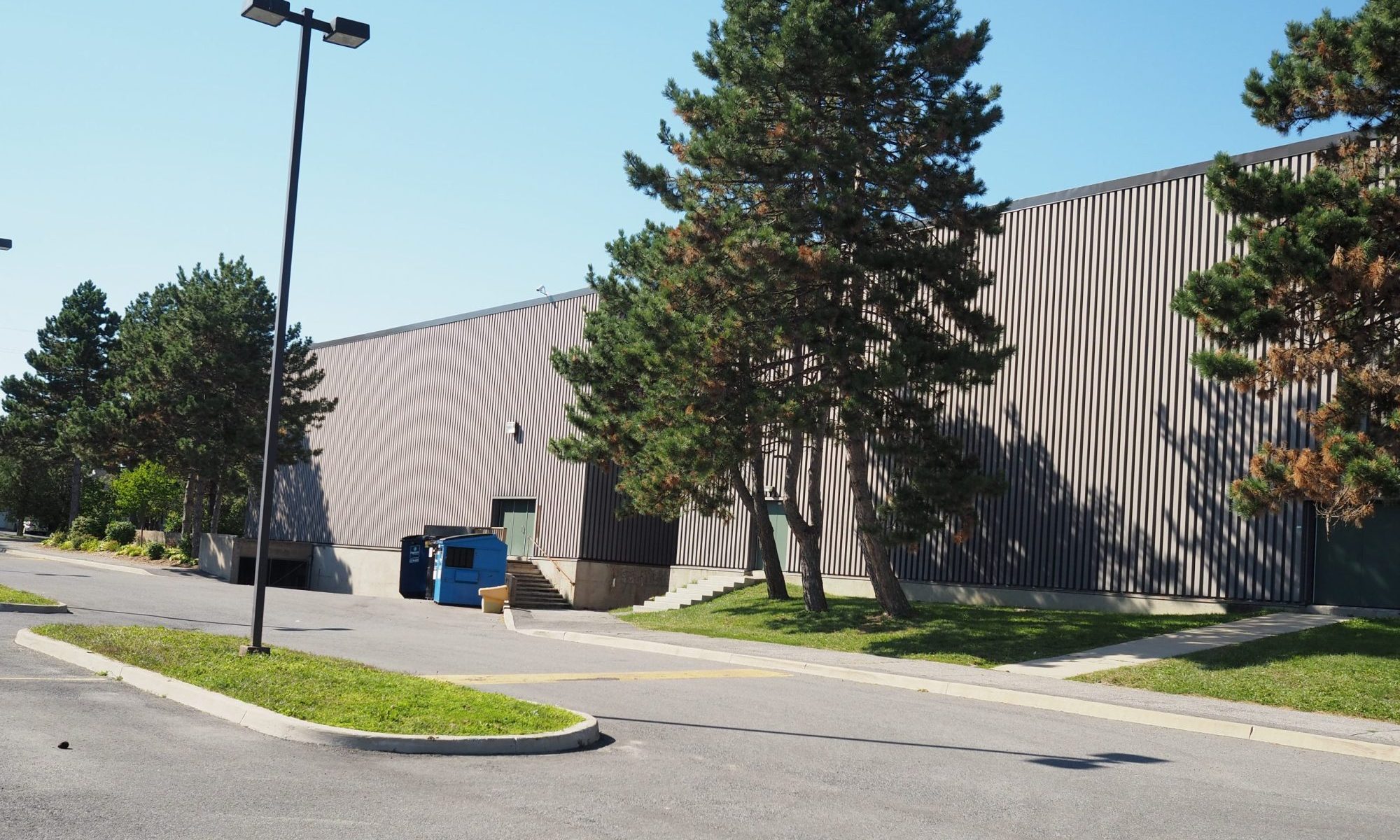
Emphasizing mass worked on the site due to the large setbacks and the distinct emphasis of the bright colours creating contrast. Unfortunately, as part of it being repurposed for use as St. Patrick’s High School the bright colours were significantly subdued, flattening the architectural composition, leading to an overemphasis of the building’s overall mass rather than its component parts. Combined with the poor aging of the metal panels (UV exposure), the general lack of windows and the dark window tinting, today one gets the impression of a bunker. I have not had a chance to go into the building so feel free to highlight the overall interior experience in the comments below.
Exploring the Capital
Suburban Ottawa

