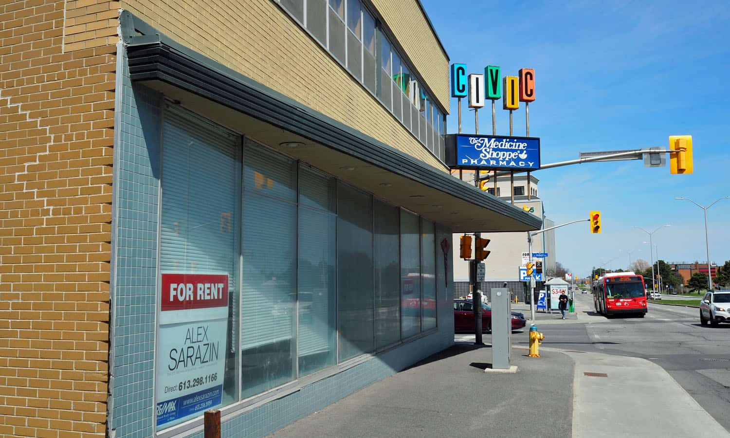
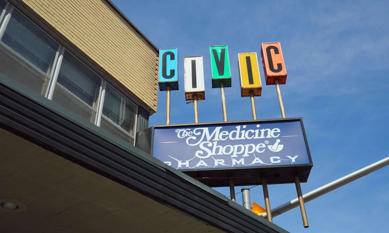
Civic Pharmacy
-
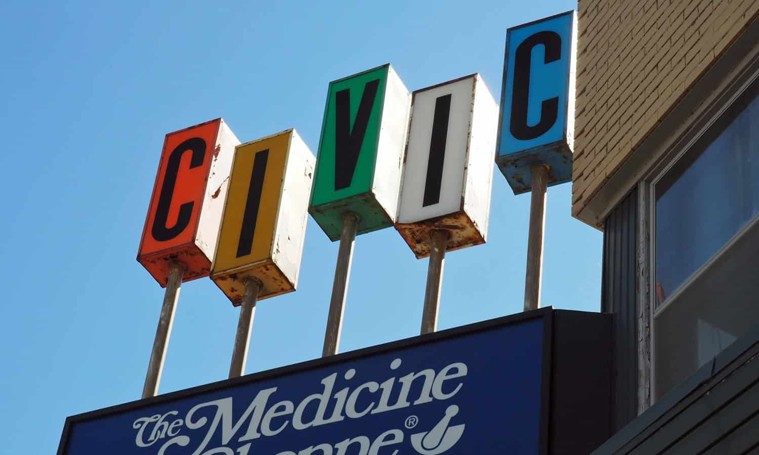
Sign detail
-
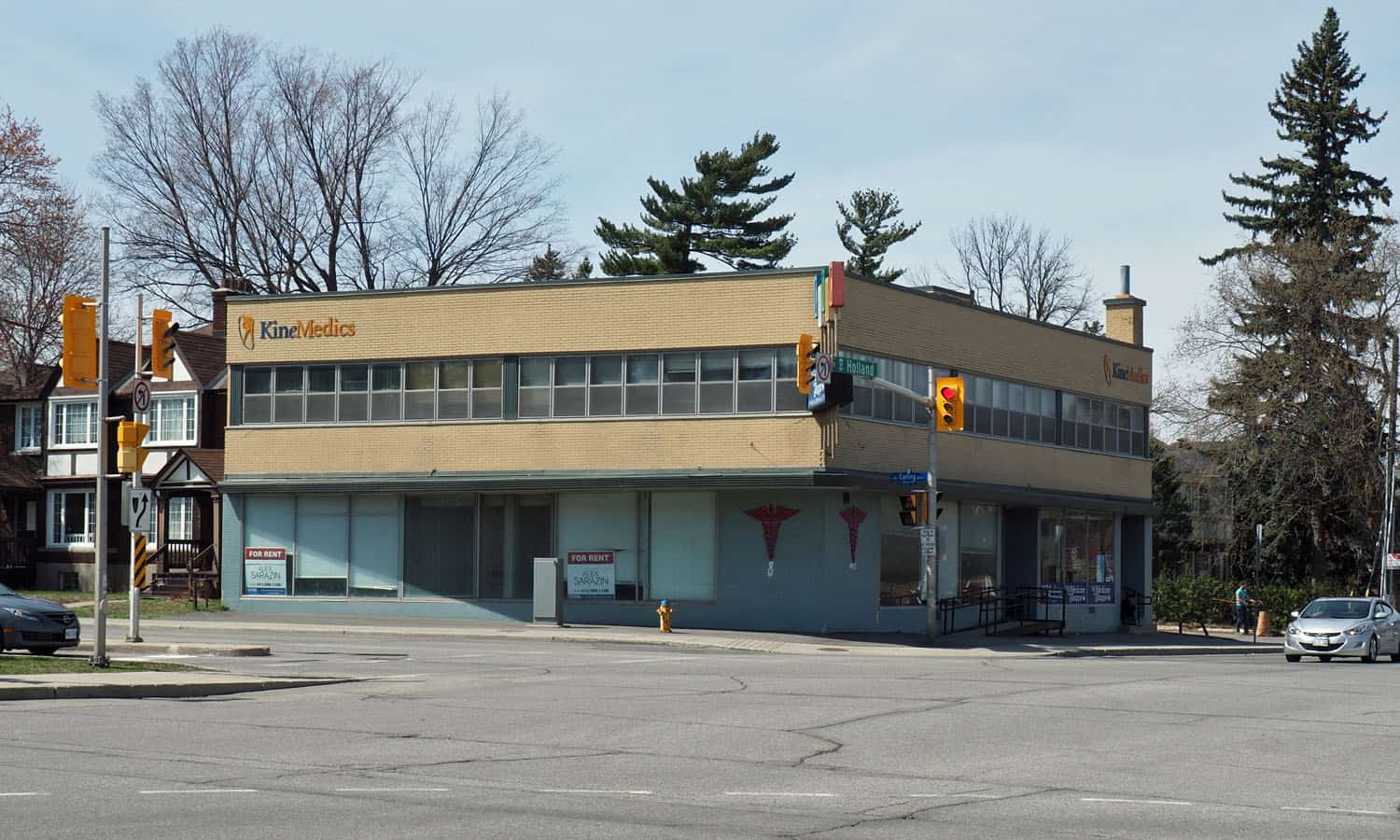
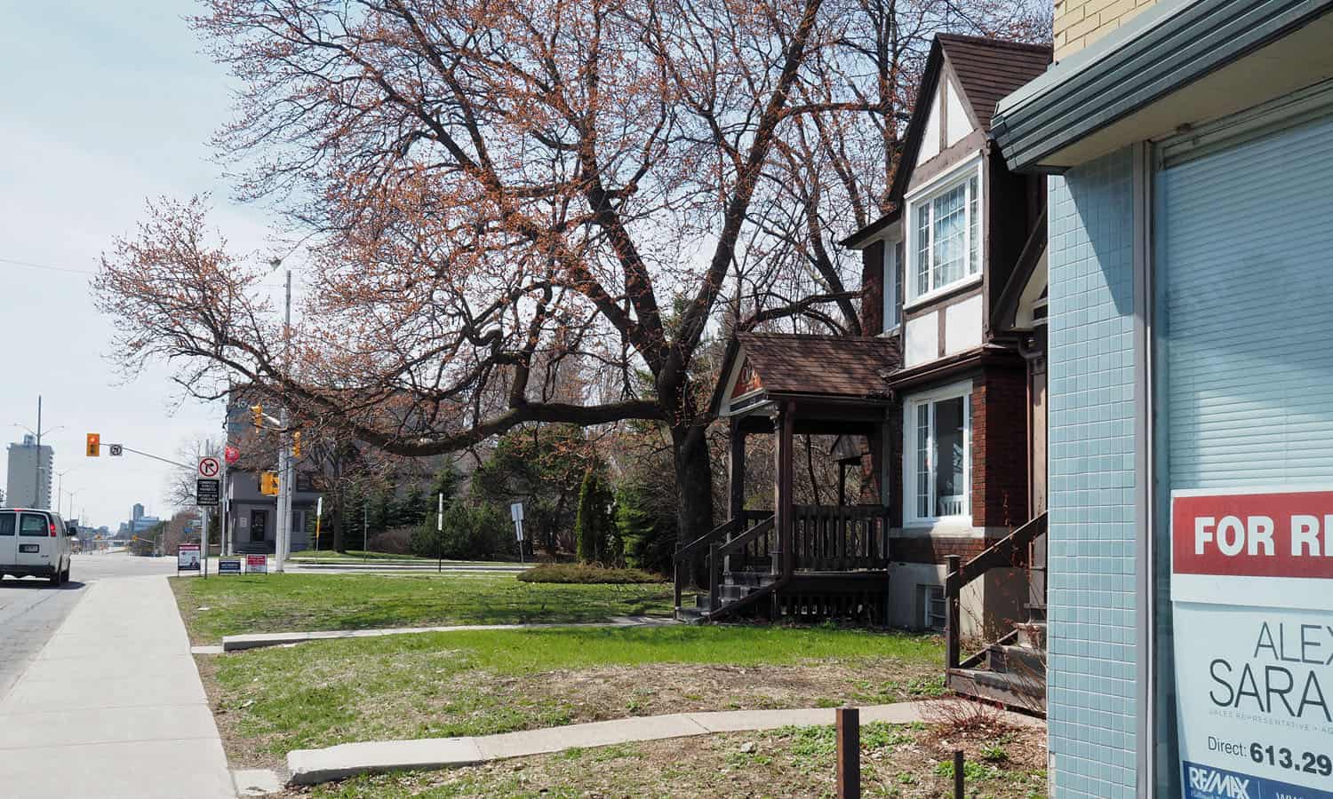
Corner of Carling and Holland Avenues
-
Carling Avenue street frontage
-
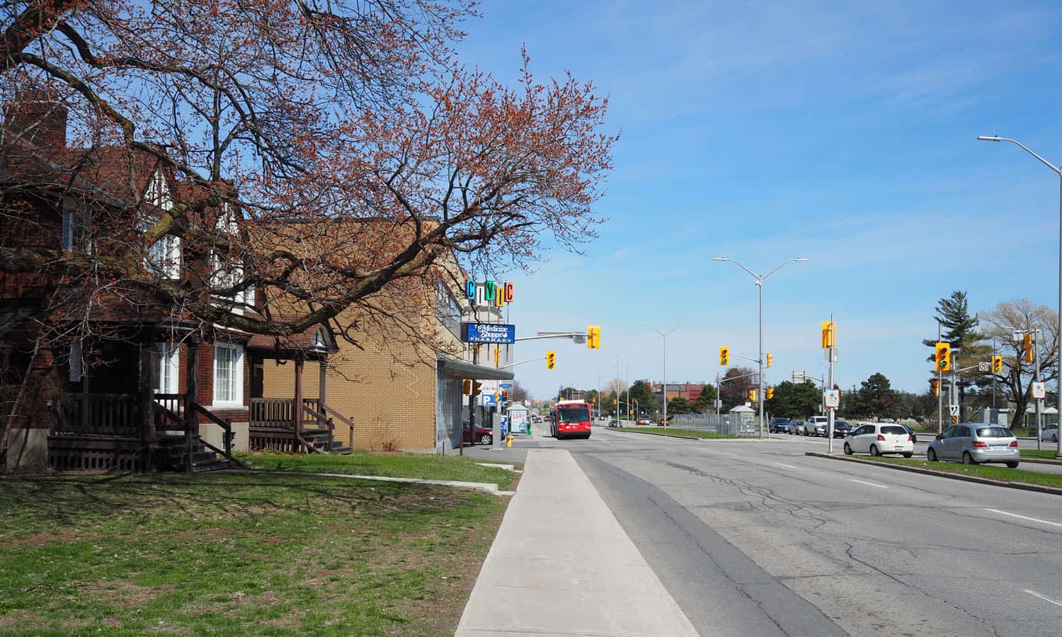
Looking east on Carling Avenue with the Civic Pharmacy in the background
-
Looking south on Holland Avenue
-
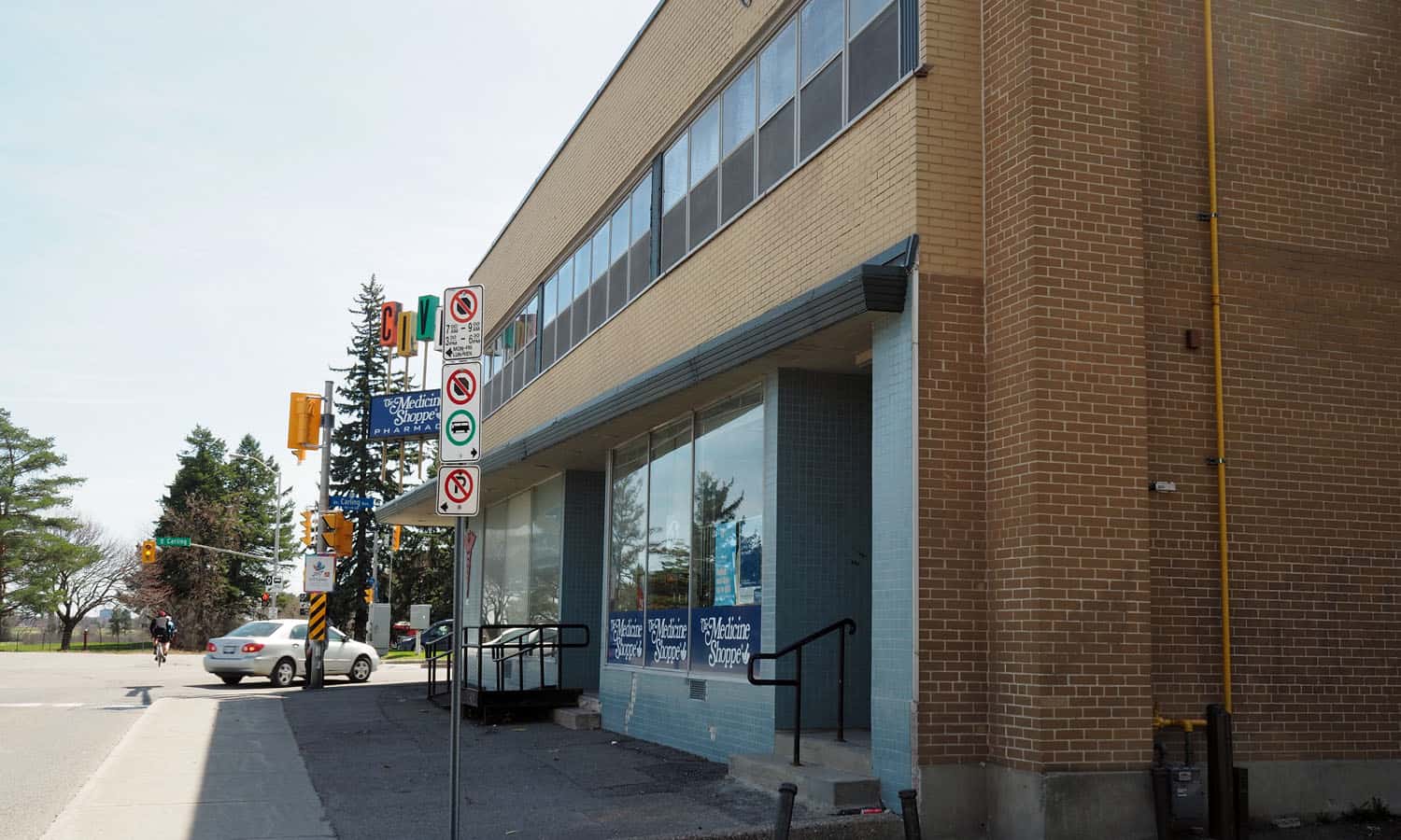
Holland Avenue elevation (east elevation)
-
View of the corner sign from Carling Avenue
-
Brick detail of the southwest corner of the building
-
Looking west along Carling Avenue highlighting the adjacent context
-
Overhead canopy detail
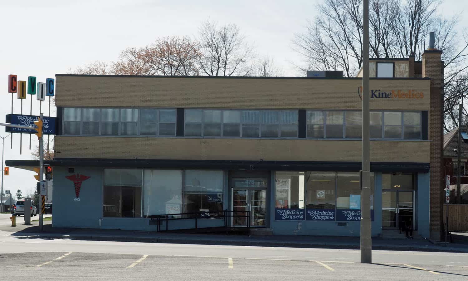
The Civic Pharmacy is a modest buff brick building situated at the corner of Holland and Carling Avenues, one block west of Ottawa’s Civic Hospital. Along both of the building’s primary frontages, large windows provide a high degree of porousity for pedestrians passing by. Overhead an angled canopy which increases in depth as you approach the corner also enhances the pedestrian experience that the building provides. This is something you would not necessarily given the car orientated nature of the street.
A key element of the building’s character is its googie-sign with five multicoloured letters that once rotated. These types of signs were once common, especially for roadside architecture of the period but are now rare after decades of bylaws that restrict the use of projecting signage. This restriction effectively eliminated this creative outlet and sense of fun that these elements can provide. While not necessarily architecture in the purest sense, the uniqueness of the sign and its playful character make it a local marker worthy of recognition. The sign is also the inspiration for the Capital Modern logo. It’s balance of modern association and playfulness provided provided an ideal image for the site.
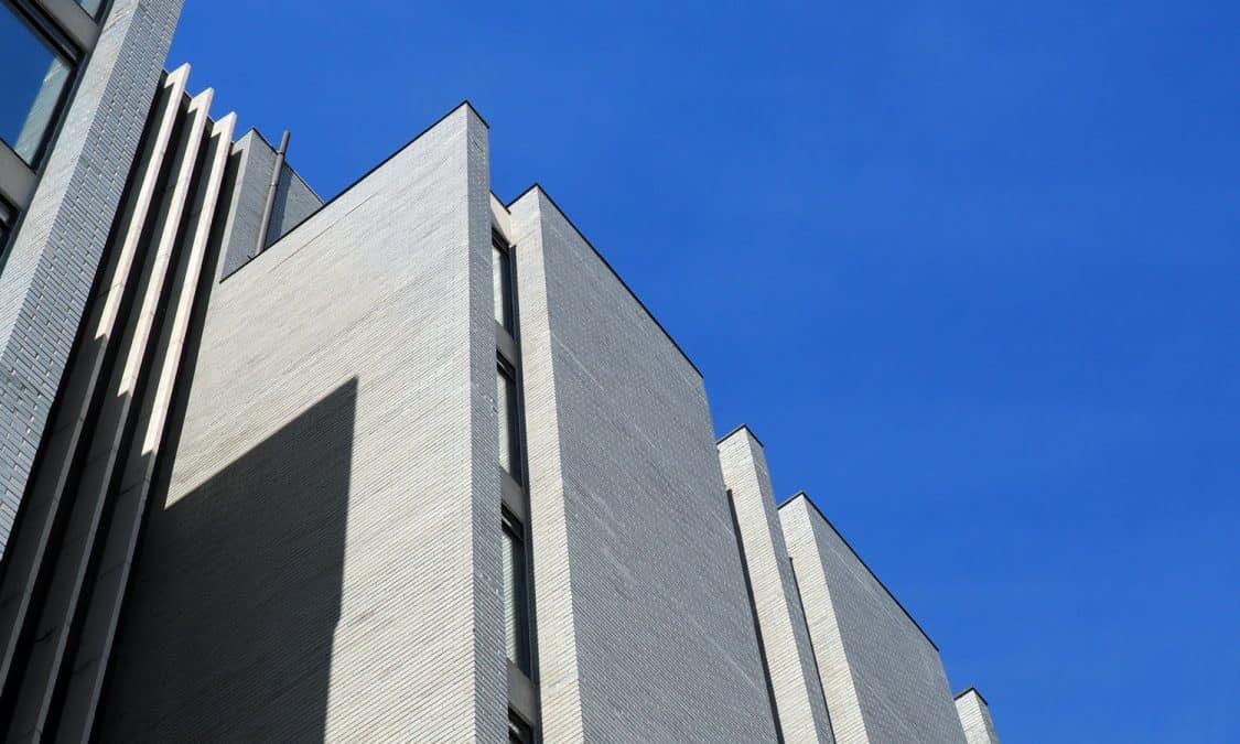
Other architectural elements of note include ribbon windows on the second floor, subtly articulated brickwork at the corner and a well scaled response to the surrounding residential structures.
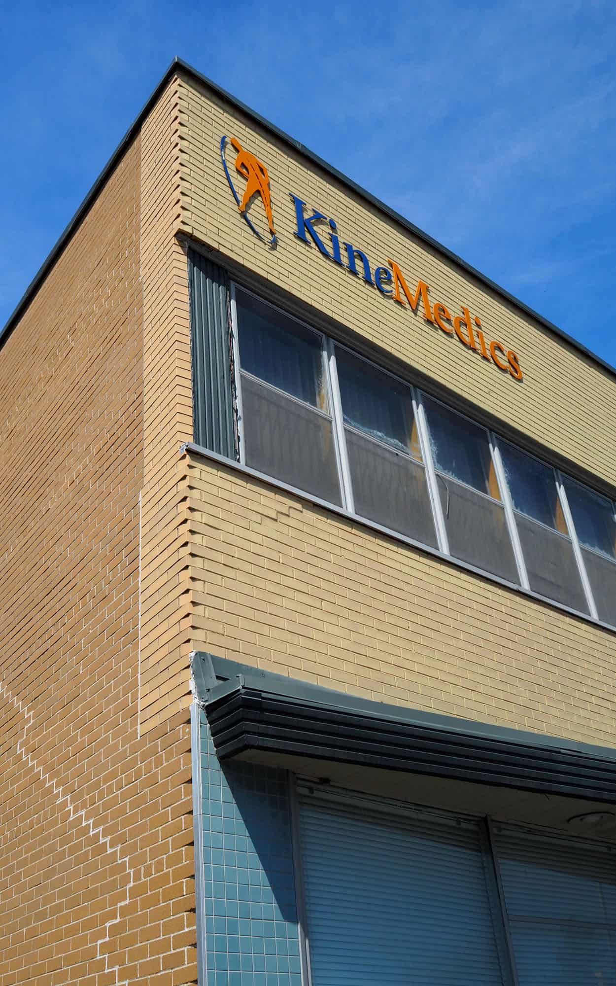
The building has been re-clad twice, once in 2018 and again in 2020. The multicoloured sign has persevered throughout these changes, and beneath the current metal panels on the facade the yellow brick remains.