Canadian Medical Association House
1867 Alta Vista Dr., Ottawa, ON
Ottawa Inner Urban
Office
Webb Zerafa Menkes Housden
1968 - 2016
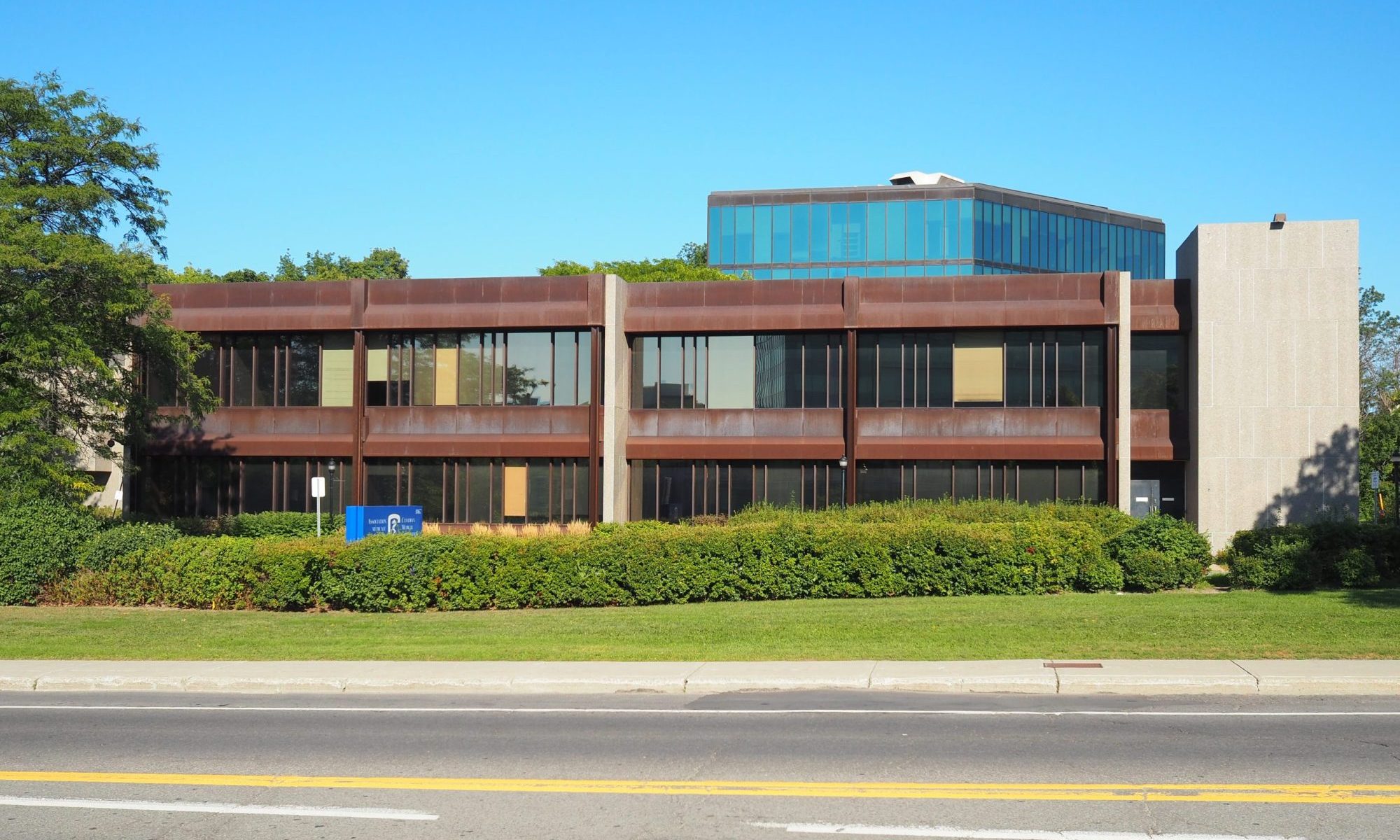
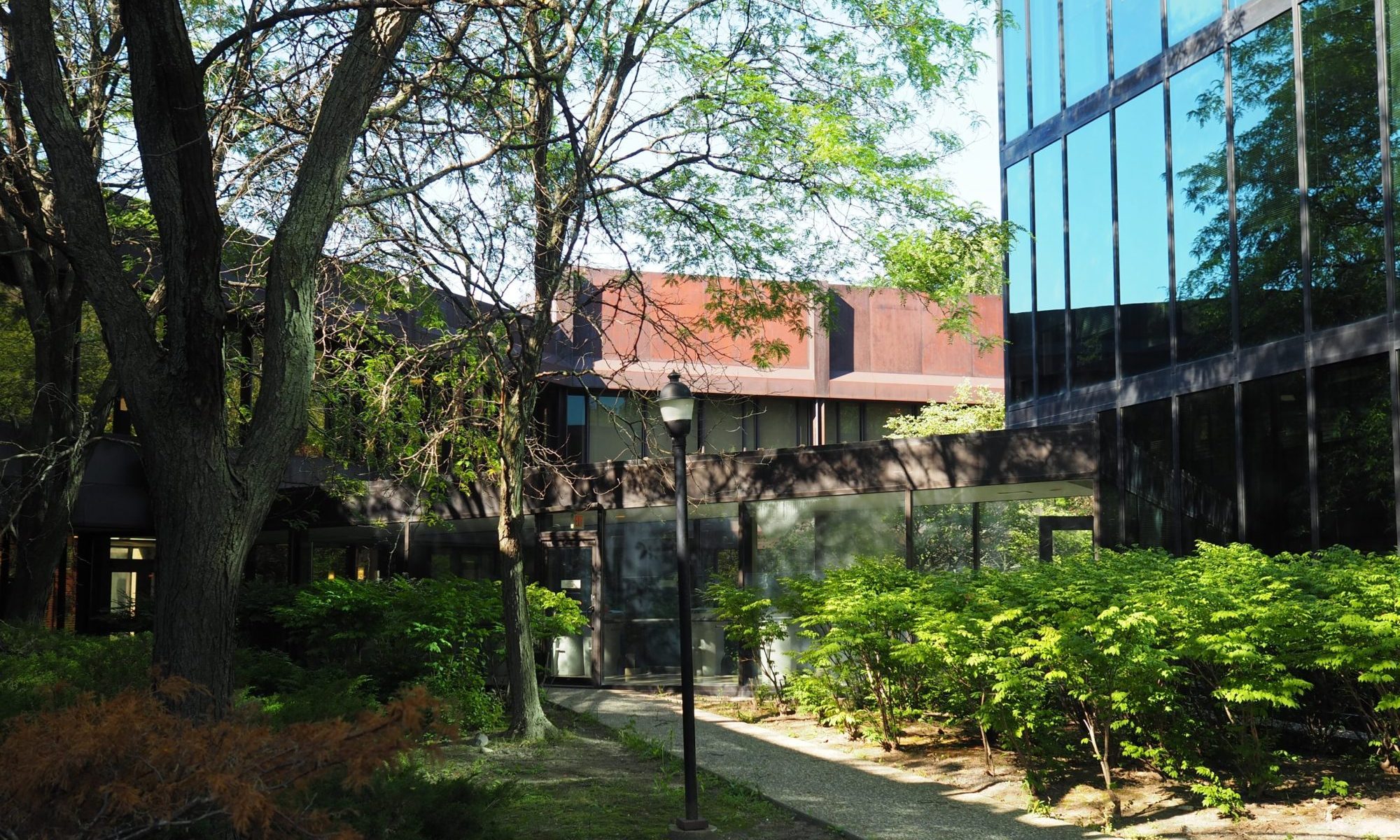
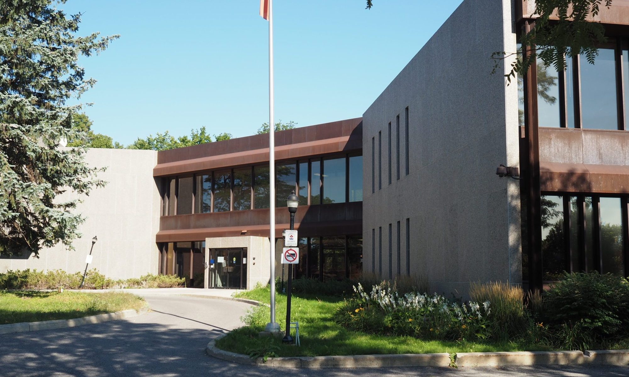
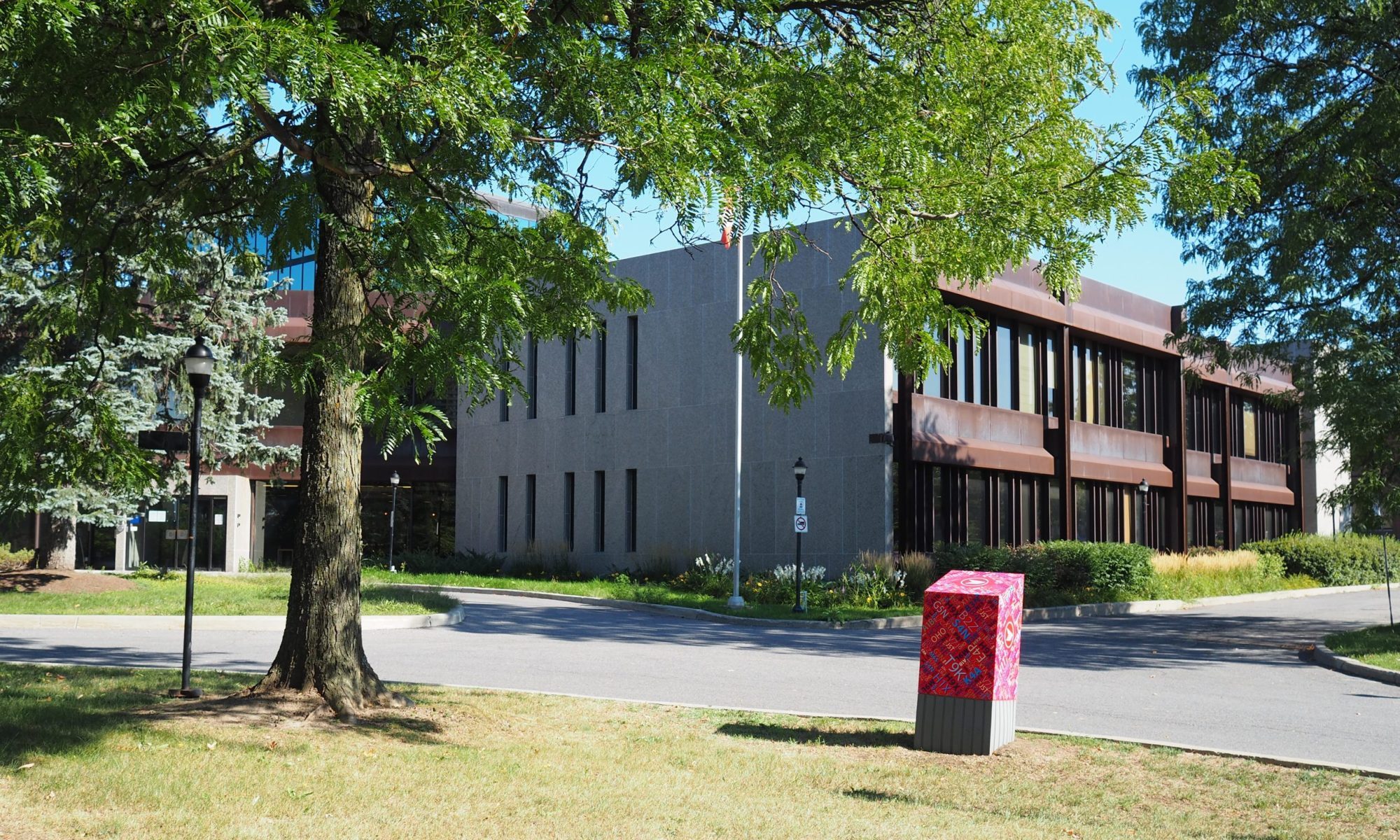
The Canadian Medical Association House (CMA) is one of the most noteworthy small scale office buildings in Ottawa and few are even aware of it. Arranged with two offset primary masses with a connecting glazed link, the building is well handled with a high degree of design rigour and clearly expressing its internal organization. Situated north of the entrance is the executive wing with a library, kitchen, dining room, lounge and conference rooms and the main boardroom. Offices or both the general staff and the executive staff are situated south of the main entrance.
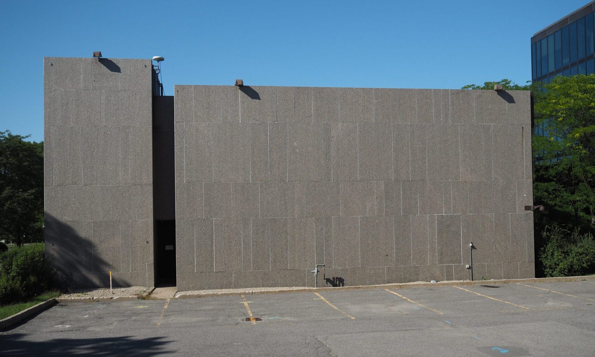
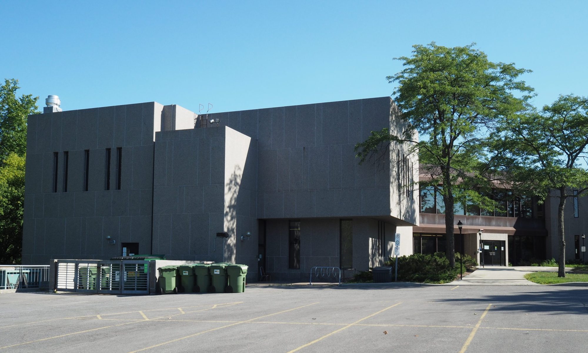
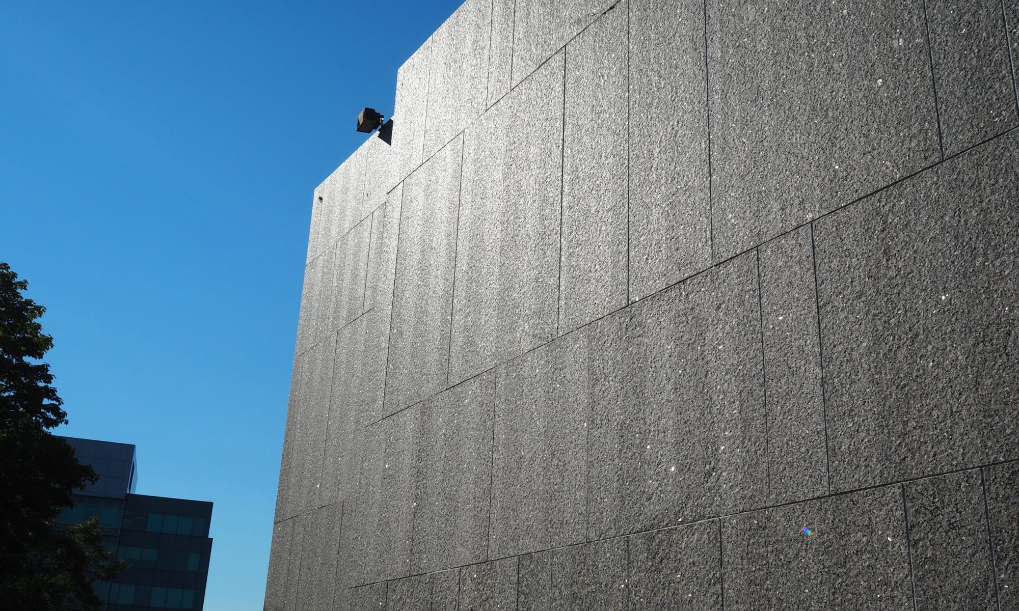
Reflecting the more insular uses, the majority of the north wing is finished in granite with the exception of the east facing lower level dining room and lounge and the upper level board room. These glazed areas face towards the forest and former garden to visually connect these interior spaces to the surround natural landscape. Solid areas, finished in granite primarily face the parking lot or the service pad where the HVAC is located to the north end of the building.
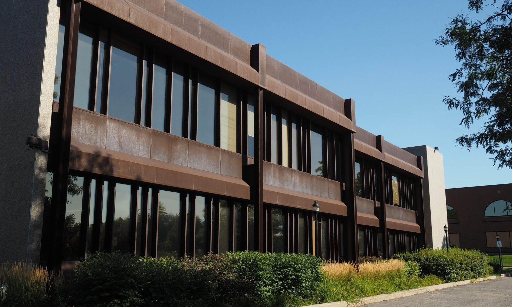
The south wing, is finished in a mixture of glass and Cor-Ten steel with areas of granite panels. These granite panels are deliberately positioned to mark the location for a future addition attached at the south end of the wing. This is why the end of the wing, abutting the south parking area appears cap-like .
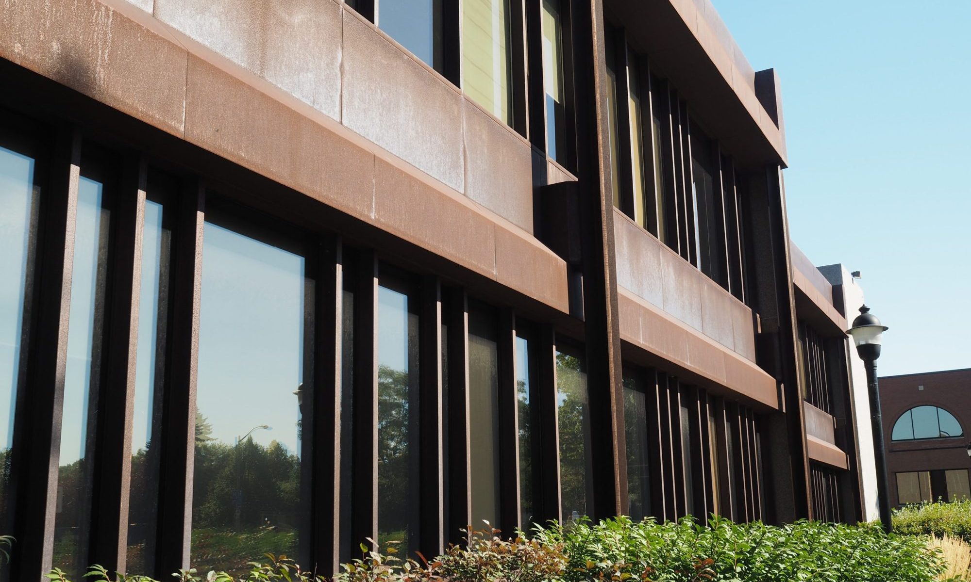
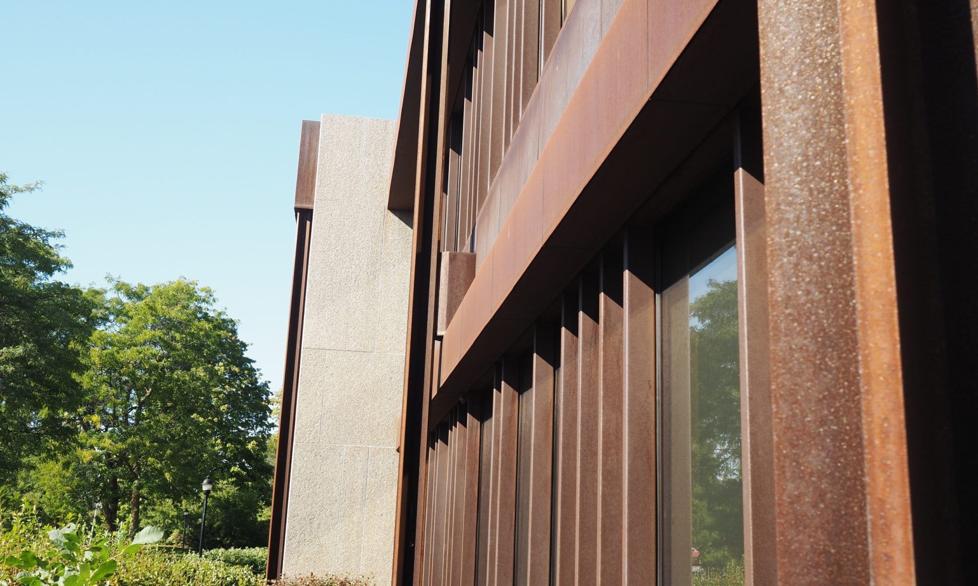
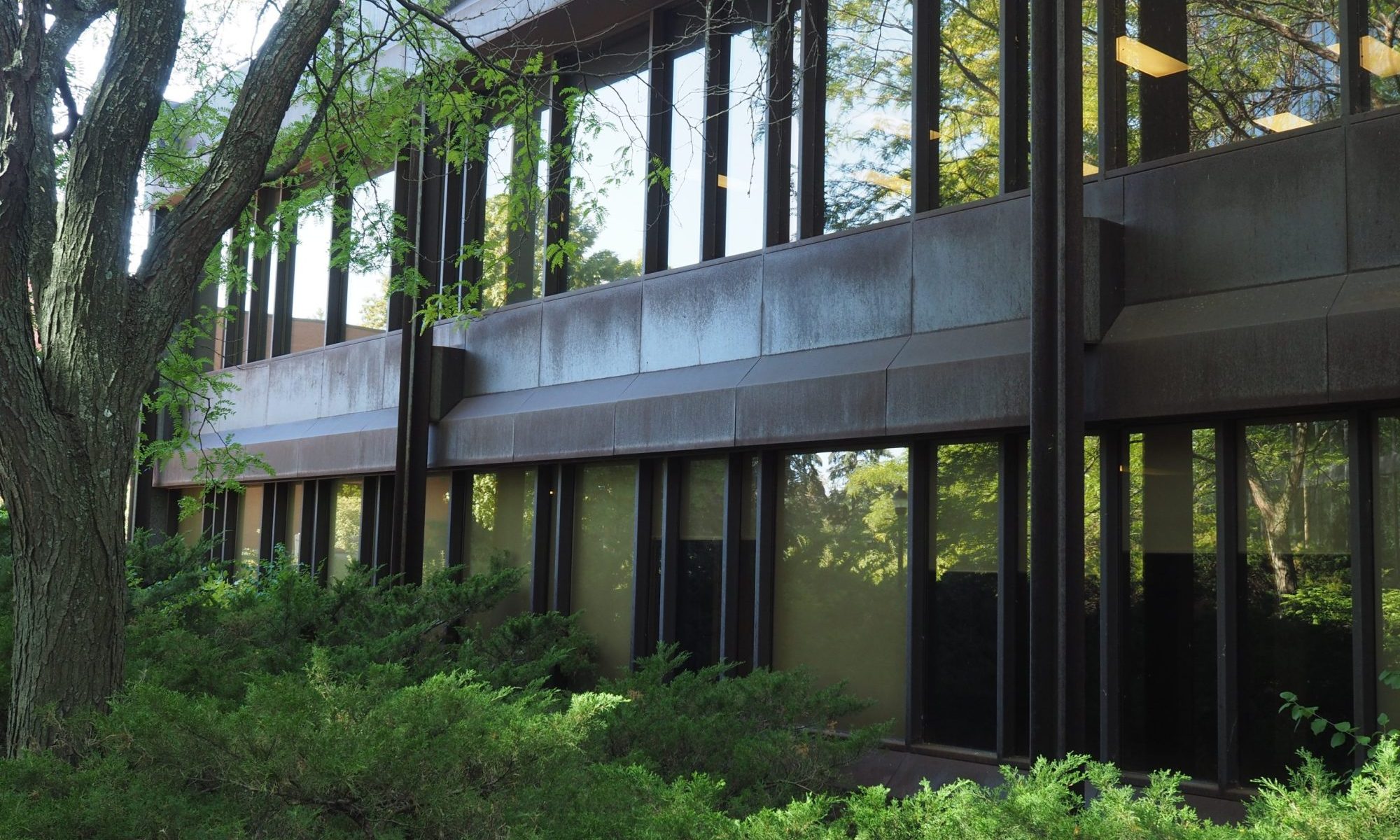
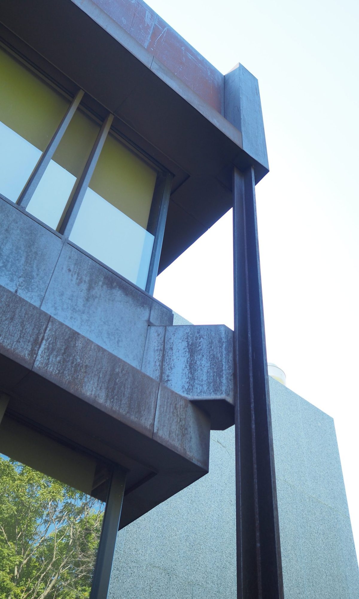
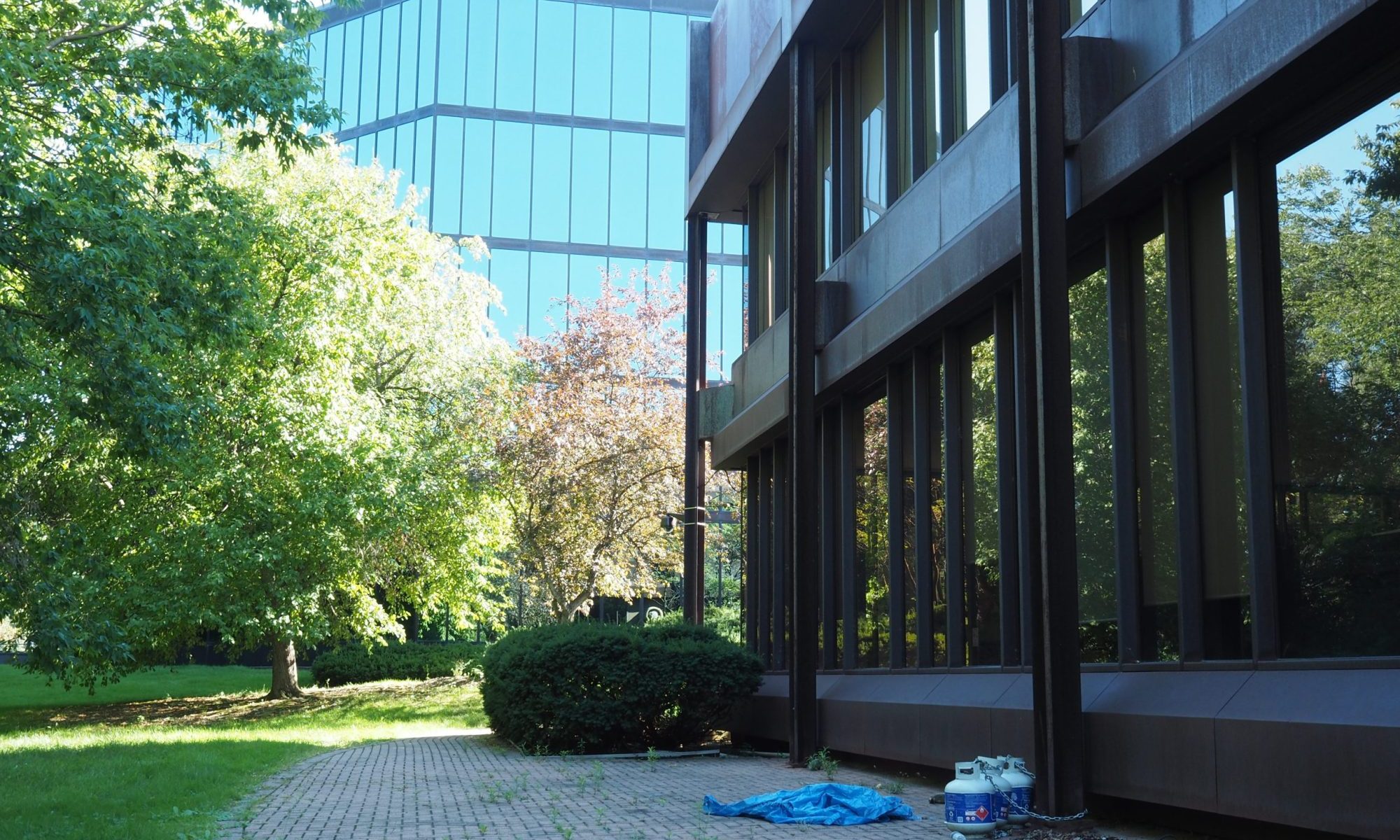
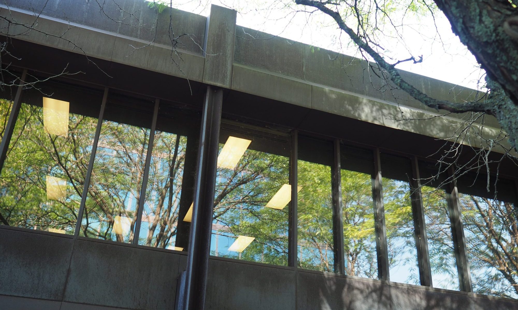
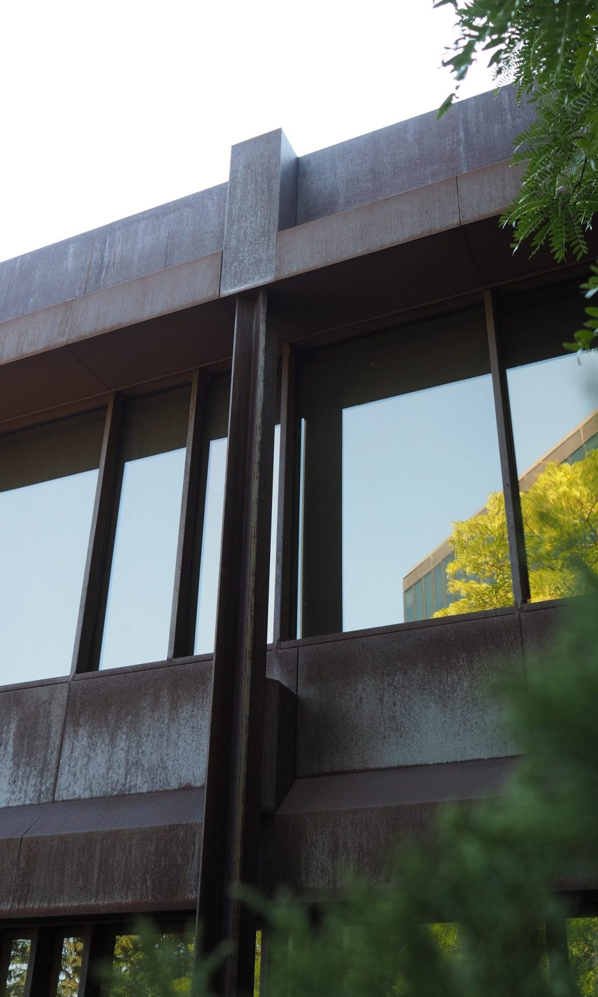
While the granite cladding is well proportioned and sparkles beautifully in the sunlight it is the use and detailing of the Cor-Ten cladding that really make this building stand out. Reinforcing the low slung nature of the building the heaviest Cor-Ten elements are the articulated horizontal BANDS that ground the bottom, separate the two floors and crown the top. Adding to the drama of the horizontal is the significant depth play that these areas provide adding shadows and visual interest. Connecting the ribbon windows materialistically to the horizontal areas are randomly spaced deep Cor-Ten mullions that break up the glazing length in a less regularized way to further enrich the building’s visual texture. The final notable aspect of the Cor-Ten finish is the X-profile columns that are largely set forward of the façade, adding further elevational depth and defining the architectural bays. This building represents one of the few and likely the most skilled handling of Cor-Ten steel in Ottawa. It is noteworthy for its design elements as well as its sympathetic nature in relation to the building’s dual context: suburban office park and natural forest.
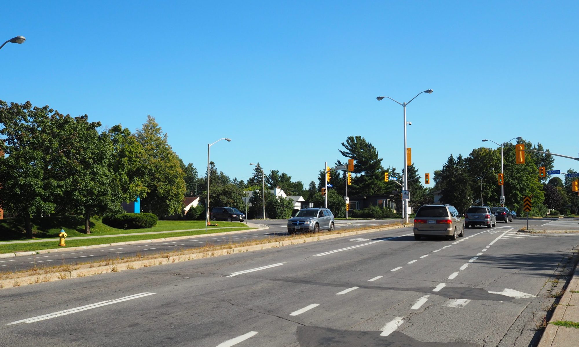
Reflecting its context, CMA house is set back from the street to provide space for landscaping and a parking access driveway between the main street frontage and the closest sidewalk. Generally, the associated landscaping is kept low allowing unobstructed views of the buildings south wing. Only at a pedestrian scale and speed the subtlety and richness of the building can be fully appreciated. Most of the design elements are difficult to appreciate from a car which is the primary mode of transportation used in the area, meaning that very few people, other than perhaps the building users, are afforded the opportunity to truly experience the quality of this building.
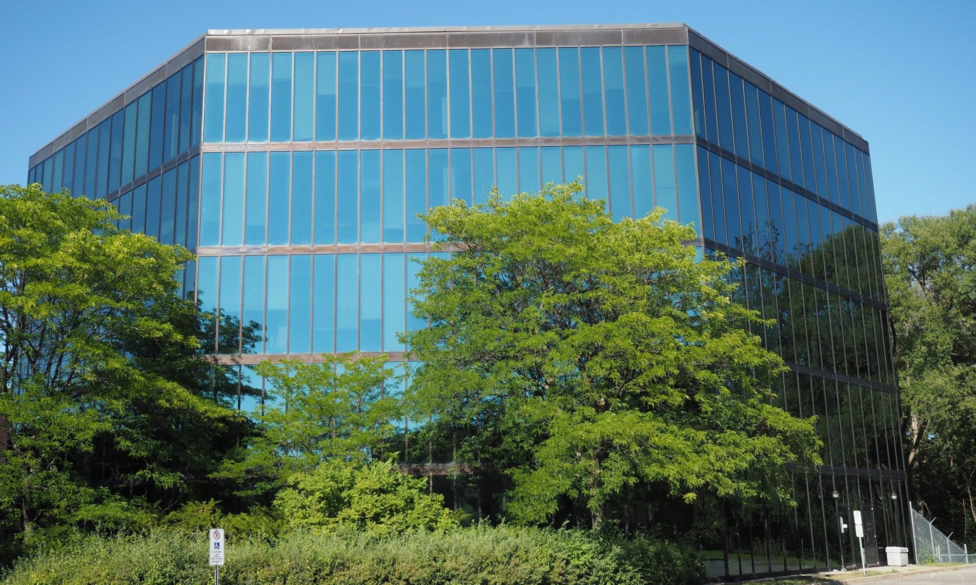
To accommodate the growing needs of their organization, CMA House was expanded with a 4-storey, trapazodal-shaped building set perpendicular to the central bridge and occupying a significant portion of the rear garden. This siting, while salvaging the south parking lot eliminated a significant portion of the building’s immediate natural context and disregarded the intended addition location off the south wing. The addition was completed in 1993 and is clad in a simple reflective curtain wall that fails to match the level of detail present in the existing building. While the contrast in scale and detail is significant the addition does create an interesting outdoor space between the two buildings south of the connecting walkway.
Unfortunately, the building’s location is not a place where most people look to find architectural quality. That being said CMA House is a significant building, possessing an unusually high level of design attention, while also reflecting the exploration of new materials and the office park typology. It is too late to save the building with the CMA moving out on July 1, 2016 and the building stands vacant until it meets its end to accommodate a yet to be announced replacement.
One would hope with the on-going losses of buildings at different scales and types from the Modern-period that a new approach would be taken, one that respects the potential architectural value present, while also capturing the embodied energy that the existing building represents as part of creative and responsive adaptive reuse and expansion projects.

