National Arts Centre Logo
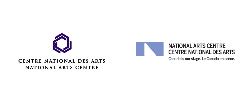
Deisgned by Ernst Roch and Rolf Harder in 1969 the original National Arts Centre logo came at a very ripe time for the graphic arts in Canada. Combined with the enthusiasm surrounding Canadian Centennial and the associated events and the tremendous growth of arts and culture in the country around this time, this logo was born during the same period as the CBC logo and the CN logo, icons that have stood the test of time.
Derived from the design of the NAC Building, resting the junction of the Ottawa street grid and the Rideau Canal, recognizing both in its grid, resulting in a hexagon being selected as the dominant organizational element throughout the building and its associated landscape. As such a dominant element employing the hexagon within the logo seems obvious in hindsight, but does tie it directly to something physical rather something more amorphous that would be more directly associated with the organization.
Using the hexagon as a departure point for a simple but iconic graphic, the logo also recognized the three arts originally accommodated by the National Arts Centre including Music, Theatre and Dance. Since opening its doors the arts represented within its wall and more broadly by the organization has grown since 1969 to include six different disciplines including Music, English Theatre, French Theatre, Dance, NAC presents and NAC Scene.
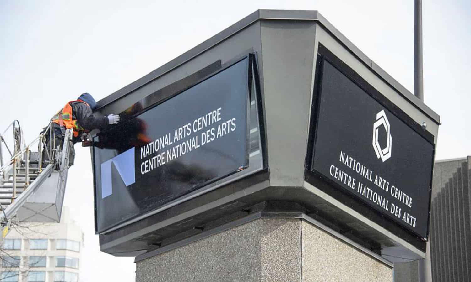
The original logo with its overlapping hexagons was replaced by the National Arts Centre organization in 2014 as part of its on-going push towards the organization’s fiftieth anniversary and a desire to present a more place-specific/pan-Canadian image. The new spotlight logo was designed the Scott Thornley + Company.
Although the original logo is no in use it is still found in various locations around the building. This includes things like the door handles and various signage around the building. It is also recognized in the name of the podcast studio on site called the Hexagon Studio.

Original logo versus 2014 logo
In the end the logo switch represented a desire to broaden the organizations base and distance itself from its association with its namesake building. The change also disregarded that although the original logo was designed to recognize the three original arts, the hexagon also recognizes the current six disciplines being of six sides.
Image courtesy of Under Consideration
