Loeb Building
Loeb Building, Carleton University, Ottawa, ON
Carleton University
Ottawa Inner Urban
Education
Jim Strutt
1967
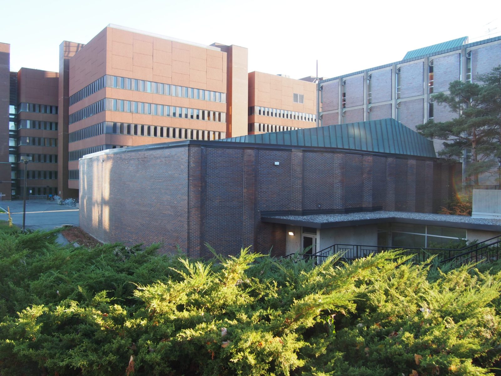
The Loeb Building, completed in 1967, is located on the Carleton University campus in Ottawa encapsulates many of the key tenets being explored within post-secondary education at the time of its construction. Core to the new approach was the desire to democratize education and encourage interaction between students and professors, allowing for free exchange of ideas, promoting dialogue and ultimately encouraging creative thought. Architecturally, Within the Loeb Building interaction was encouraged by housing all of the required spaces for a single department (seminar rooms, offices and common rooms) on a single floor. The four interconnected towers provided a certain level of flexibility in accommodating departments of different sizes.
In plan, the majority of the building is generally consistent with four 6-8 storey towers housing academically-focused spaces resting on a series of lower levels housing the core of the cross-disciplinary social spaces. These cross-disciplinary spaces included a large cafeteria, an exterior terrace extension of the campus level entry space overlooking the Rideau River and a multi-storey volume complete with a mezzanine that linked two different tunnel levels. These social spaces promote(d) multi-disciplinary interaction supporting the original educational intent informing the building’s program. It is a building that responds to the multi-level and multi-layered site in as engaging a way as it was permitted to do at the time.
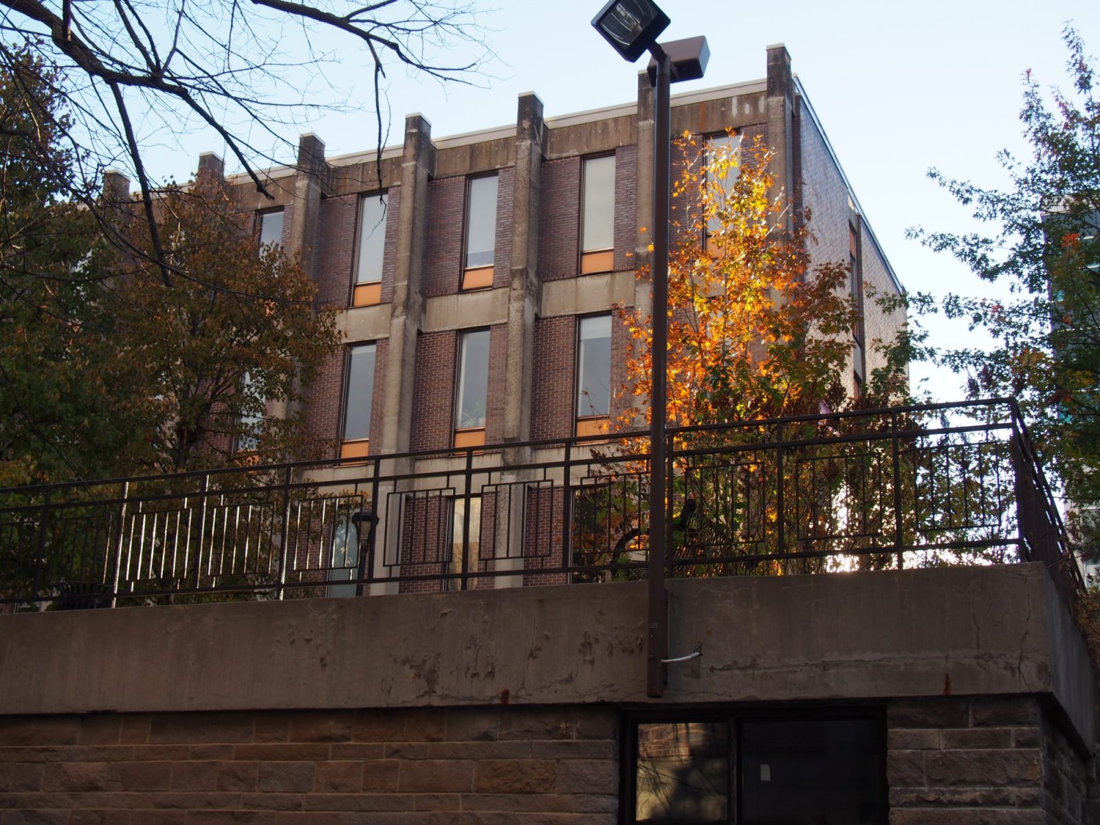
As with all good buildings, it takes time to explore and observe the high level of craft, material selection and detailing that is found throughout the building. On the exterior, the mixture of red pebbled aggregate panels and brick provide a subtle textural richness that adds to the material richness and unique patina of the red brass articulated panels located between the tower windows. Overall, the relationship between the tower proportions and the horizontality of the window and red brass panels, results in a balanced composition.
On the interior subtle detailing can be found throughout, sometimes in unexpected places. Look under the built-in seating in the campus-level entrance and you find air grilles integrated into the brick base. Go into any room in any tower and you can appreciate the exquisitely detailing wood window shutters. When open, the shutter panels rest perfectly between the windows, drawing attention to the proportions of the window-to-wall spacing. Dwelling longer you notice the overlapping tongue and notch in the panels that locks the panels together to minimize light entry when the panels are closed.
Unfortunately, over the time the spatial needs of the social sciences program outgrew the ideals at the core to the building’s design. As spatial relationships were reworked, the intended engagement was weakened and the floor plates became more challenging to navigate. Further obscuring of the original design intent, fabrics were changed, original furnishings removed and the dynamic multi-storey tunnel connection was infilled with two floors of additional space.
As a building ages it is often adapted and changed to meet the needs of an evolving program as is the case for the Loeb Building. As the changes have mounted, the original clarity has and social motivations have been obscured. If the core design tenets could be reevaluated and considered through the lens of currently ideal educational approaches and applied more holistically to the entire building, the rich potential of the Loeb Building could be once again be realized.
Carleton University


